B2B UX Case Study
Improving Product Evaluation & Bulk Quote Experience
Redesigning the product discovery, evaluation, and bulk quotation experience to help corporate buyers compare products, request customized quotes, and streamline procurement decisions.
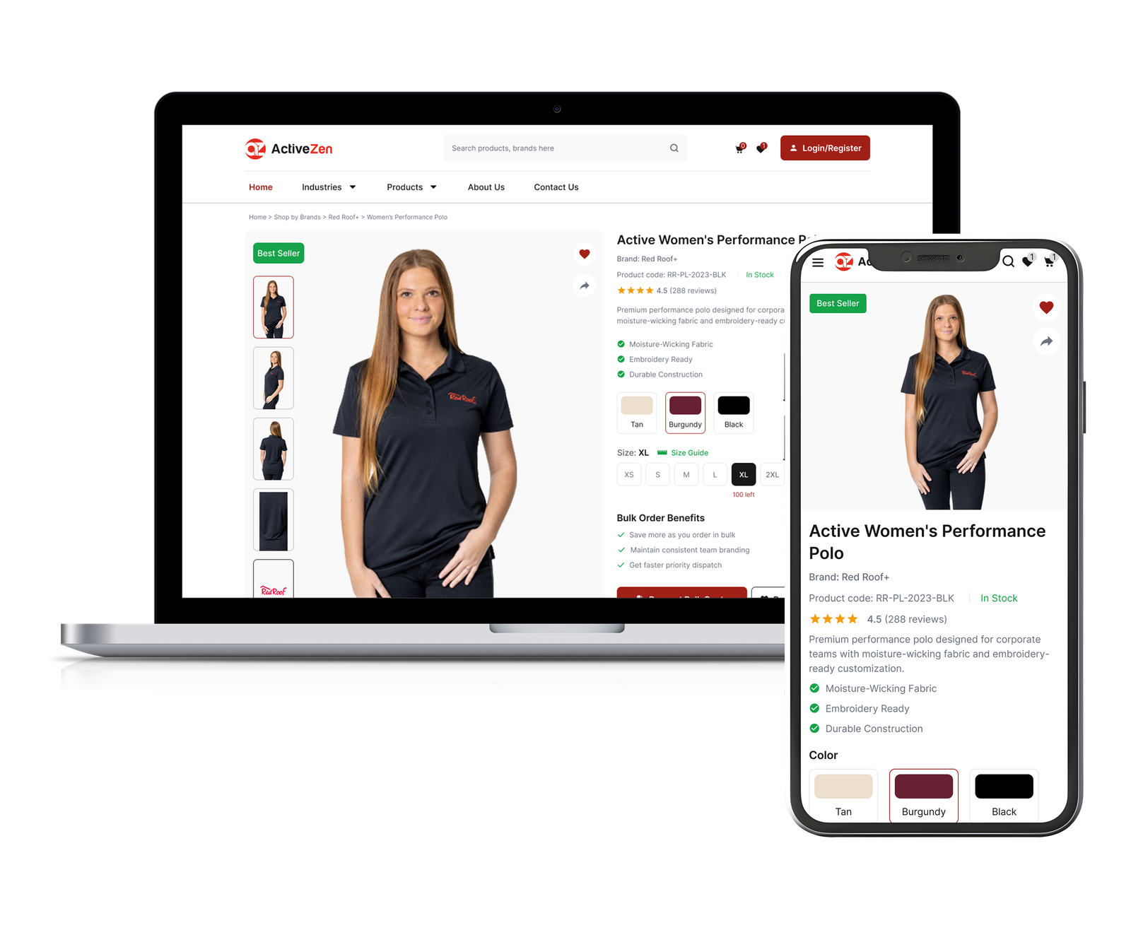
Project Overview
ActiveZen is a B2B corporate uniform supplier that helps businesses source customised uniforms for their teams across the USA. Procurement teams use the platform to explore products, compare options, and request bulk quotations.
My UX audit revealed that the existing experience made it difficult for buyers to discover products, evaluate key information, and submit bulk inquiries efficiently, creating friction throughout the procurement journey.
Objective: Redesign the product discovery and bulk quotation experience to help business buyers evaluate products more easily, request customised quotes, and make confident purchasing decisions.
Client / Industry: B2B Apparel & Corporate Uniform Supply
Project Scope: Product Discovery & Bulk Quote Experience Redesign
Target Users: Procurement Managers, HR & Operations Teams, Business Owners
Role & Responsibilities: UX Audit · Heuristic Evaluation · UX Strategy · Interaction Design · UI Design
Tools: Figma · Notion · Miro · Zeplin
Duration: 3-4 weeks
Understanding the Problem
To understand the existing experience, I conducted a heuristic evaluation, UX audit, competitor benchmarking, and user flow analysis. This helped identify usability gaps, content hierarchy issues, and friction points that informed the redesign strategy.
Research Methods
- Heuristic evaluation to identify usability issues
- UX audit to evaluate the overall product experience
- Competitive analysis to benchmark best practices
- User flow analysis to identify friction in the bulk quote journey
- Content review to assess hierarchy, readability, and scanability
- Responsive review to evaluate mobile usability and layout consistency
Key UX Issues
- Weak product information hierarchy
- Poor content scanability and readability
- Unclear inquiry and conversion flow
- Limited support for B2B decision-making
- Inconsistent visual structure and spacing
- Cognitive overload from dense layouts
Key Insights
- Users struggled to scan and compare products efficiently
- Product information lacked clear prioritization and hierarchy
- Inquiry actions and CTAs were not visually prominent
- Dense layouts increased cognitive load and reduced readability
- Navigation and content structure lacked clarity for B2B users
- Limited trust-building elements reduced confidence during decision-making
- The experience focused more on displaying products than guiding conversions
Research Goals
- Improve product discoverability, navigation clarity, and content readability
- Simplify the inquiry journey and support faster B2B decision-making
- Create a more structured product evaluation experience with clearer conversion-focused CTAs
Competitive Audit & Key UX Gaps
I analysed leading B2B ecommerce and corporate apparel platforms to understand common usability patterns and identify opportunities for improvement.
Product Discovery
Navigation and product categorization lacked clarity.
Information Hierarchy
Product information lacked clear hierarchy and prioritization.
Product Evaluation
Limited support for comparison and decision-making.
CTA & Conversion Flow
Inquiry actions lacked visibility and clear hierarchy.
Mobile Experience
Responsive layouts and interactions lacked consistency.
Visual Consistency
Inconsistent UI patterns reduced clarity and trust.
Design Strategy
UX Strategy
Based on the research findings, the redesign focused on improving product discovery, simplifying the bulk quote journey, and supporting faster B2B procurement decisions.
Product Discovery
- Simplified navigation and filtering for faster product discovery
- Organised product information to improve browsing efficiency
Information Hierarchy
- Structured content into clear, scannable sections
- Prioritized important product details and specifications
Product Evaluation
- Highlighted customization and bulk-order information
- Improved layout consistency across product sections
Conversion & Inquiry Flow
- Increased visibility of bulk quote actions
- Simplified the path from product exploration to inquiry
Mobile & Accessibility
- Optimized layouts for responsive viewing across devices
- Improved touch accessibility and mobile readability
Trust & Consistency
- Reduced visual clutter with a cleaner interface
- Strengthened buyer confidence through consistent UI patterns
Feature Prioritization (MoSCoW Method)
Features were prioritized based on user needs, business impact, and implementation feasibility to focus on improving usability and conversion efficiency.
Must Have
- Improved product information hierarchy
- Clear inquiry flow and CTA visibility
- Responsive product experience
- Improved readability and content scanability
Should Have
- Enhanced product filtering and categorization
- Trust-building product presentation
- Better product comparison support
Could Have
- Quick inquiry or live chat support
- Saved inquiry or wishlist functionality
Won’t (For Now)
- ERP / Procurement system integrations
Design Execution
Wireframing & Layout Exploration
Low-fidelity wireframes helped validate layouts, information hierarchy, and key user flows before moving into high-fidelity designs.
( 📌 Click on any wireframe to view it in full detail. )
Product Listing
(Browse & compare products)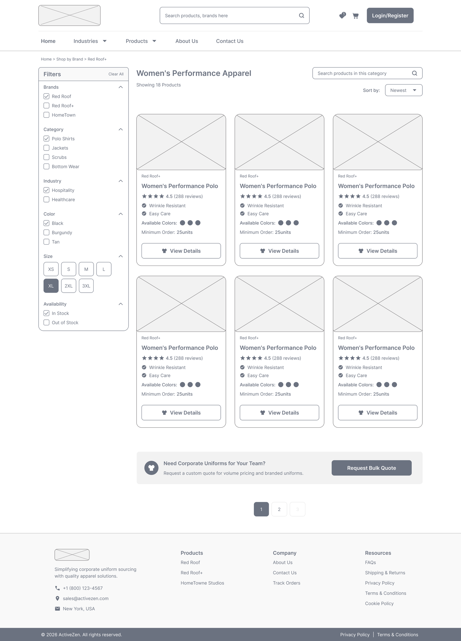
Product Detail
(Review specifications & customize)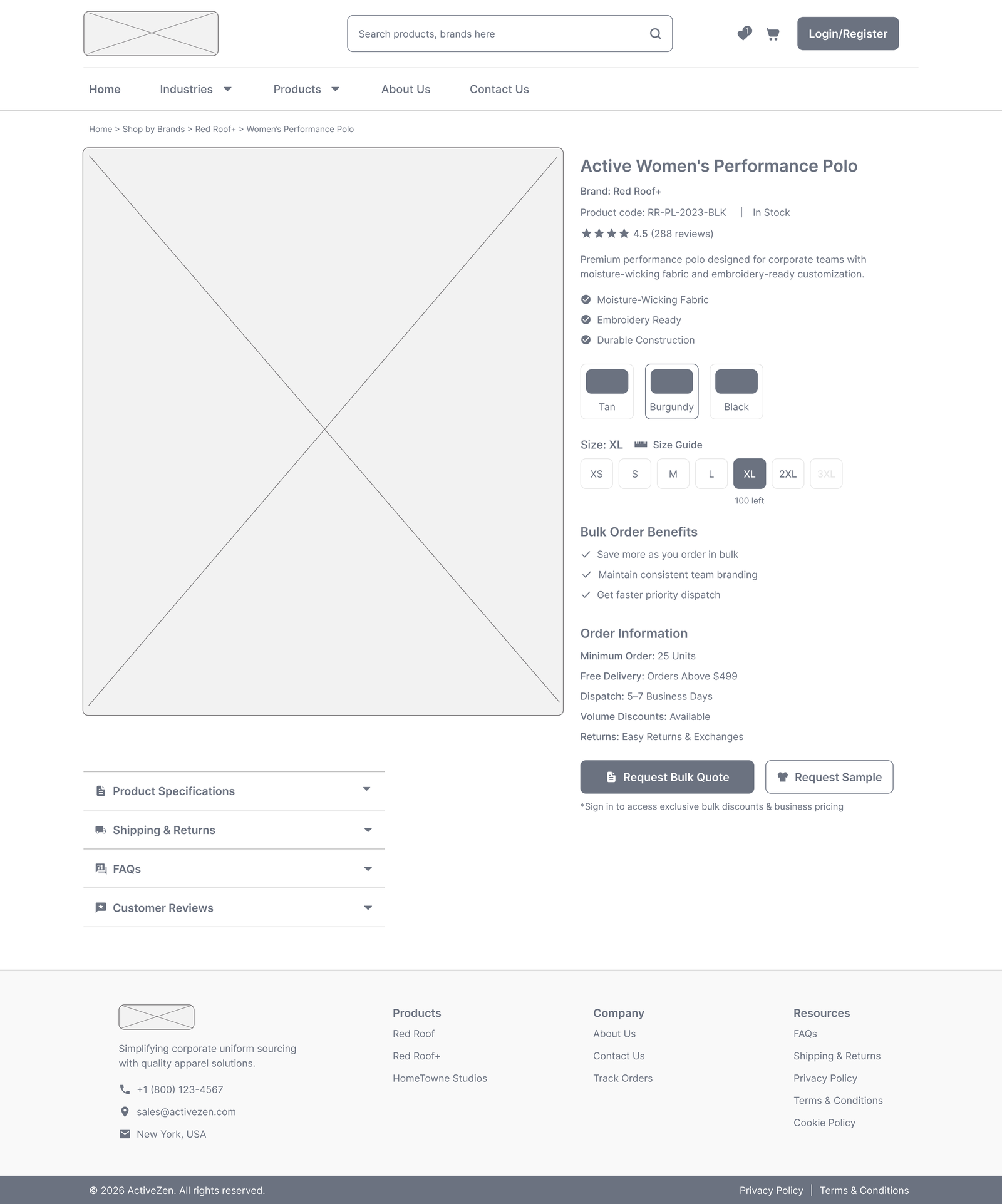
Bulk Quote Request
(Submit requirements)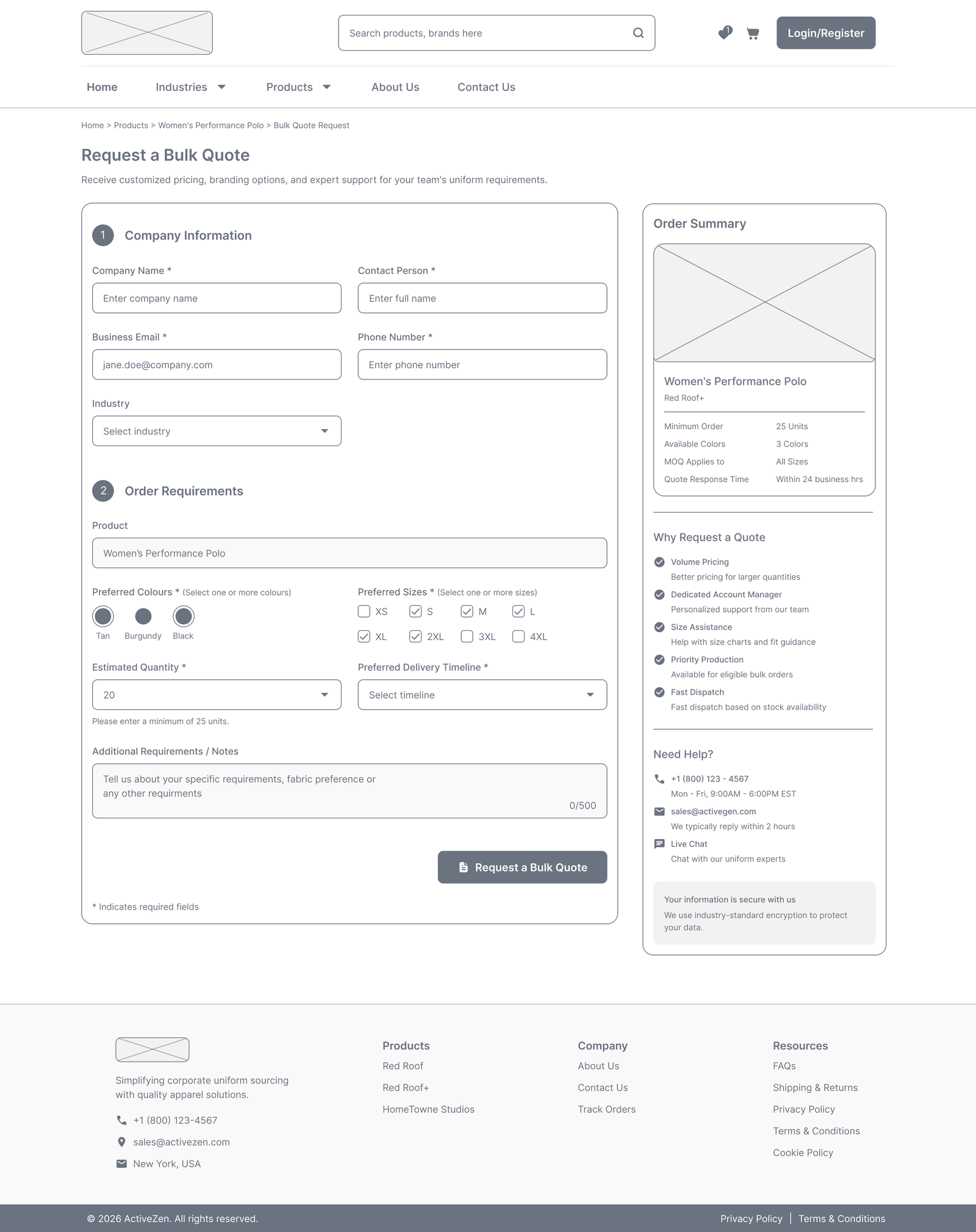
Quote Request Success
(Build trust with clear next steps)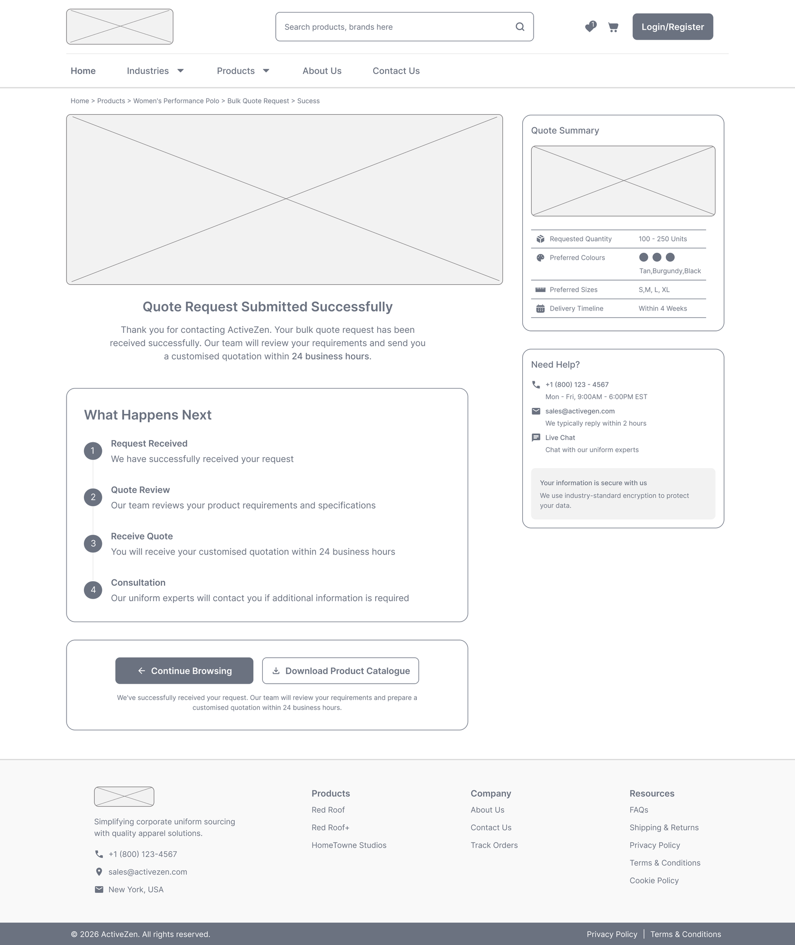
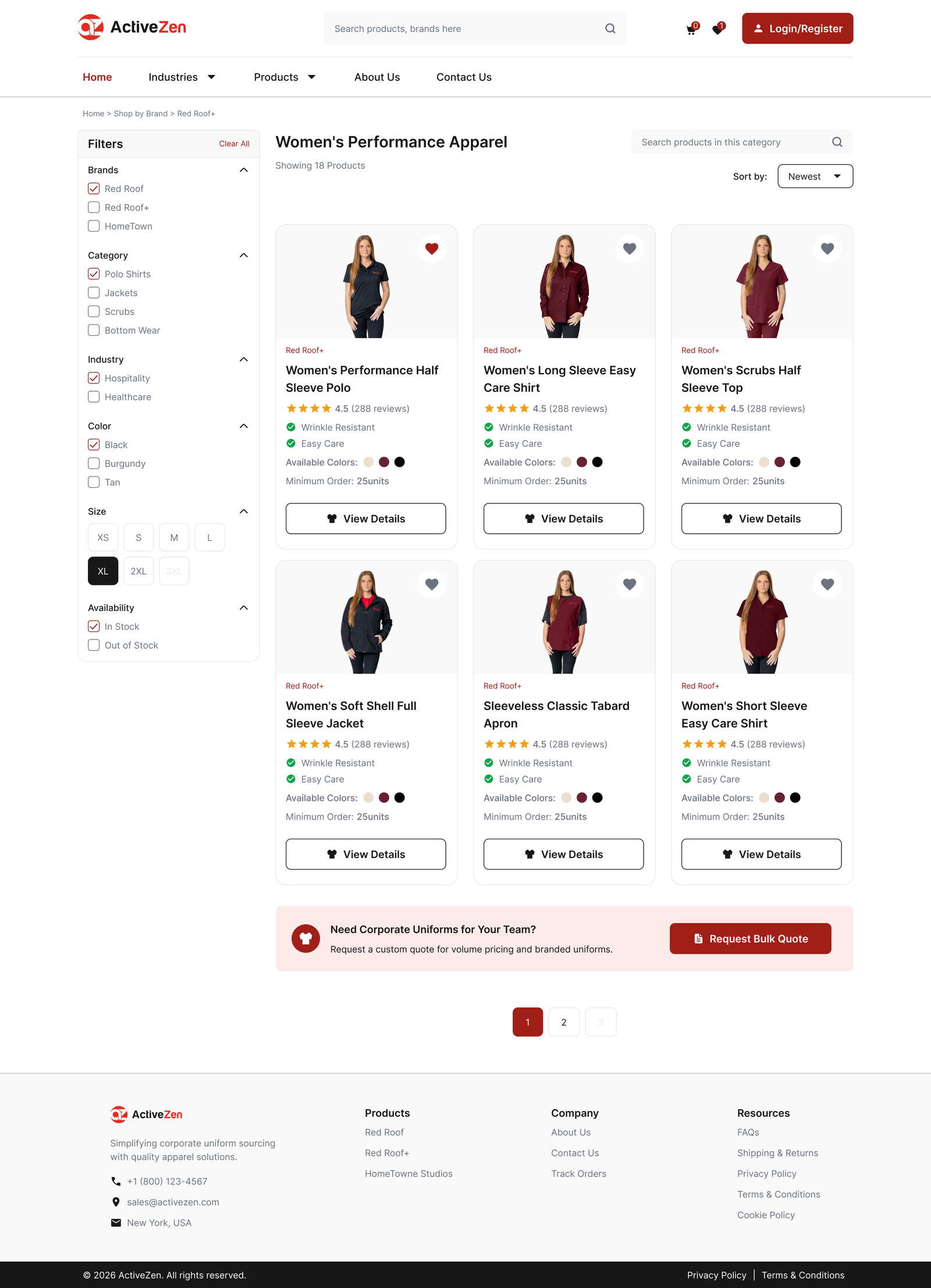
High-Fidelity UI Designs
Based on validated layouts and research insights, the final interface was designed to improve usability, accessibility, and the B2B quote request experience.
(📜 Scroll inside the frame. Tap tabs to switch screens.)

Visual Design Decisions
The visual design system focused on creating a cleaner, more structured, and conversion-focused experience tailored for B2B users and procurement teams.
Color Strategy
The brand’s core red (#E22D22) and black (#181818) were adapted into a more balanced and functional B2B interface system. Dark neutrals established a clean and professional visual foundation, while refined red tones were used selectively to highlight conversion-focused actions.
Responsive Typography Mapping
A responsive typography system was designed to improve readability, content hierarchy, and product scanability, creating a more consistent experience across desktop and mobile devices.
The type scale adapts across three breakpoints: Desktop (≥1200px), Tablet (≥768px), and Mobile (<768px).
Page Title
Semi Bold (600) 32px (Desktop) → 28px (Tablet) → 24px (Mobile)Section Heading
Semi-bold (600) 24px (Desktop) → 22px (Tablet) → 20px (Mobile)Card Title
Semi-bold (600) 18px (Desktop) → 18px (Tablet) → 16px (Mobile)Body
Regular (400) 14px (Desktop/Tablet/Mobile)Labels & Buttons
Medium (500) 14px (Desktop/Tablet) → 12px (Mobile)Examples of Token Naming
- (Page Title) --font-page-title-lg, --font-page-title-md, --font-page-title-sm
- (Section Heading) --font-section-heading-lg, --section-heading-md, --section-heading-sm
- (Card Title) --font-card-title-lg, --card-title-md, --card-title-sm
- (Body Text) --font-body, ---font-body, --font-body
- (Labels & Buttons) --font-label-lg, ---font-label-md, --font-label-sm
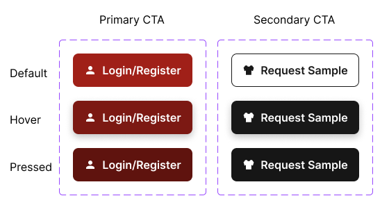
*Button Hierarchy — Inspired by Material 3
Each button type was defined to establish hierarchy and clarity.
- Primary CTA (#A02018): Used for high-emphasis actions such as “Login/Register, Unlock Bulk Pricing etc.” often paired with an icon.
- Secondary CTA (#181818): For medium-emphasis actions supporting the primary CTA.

Layout & Spacing System
To create a clean and scalable interface, I defined a simple yet flexible layout system:
- Responsive grid: 12 (desktop), 8 (tablet), 4 (mobile)
- Spacing Scale: Based on an 8px system with 4px increments for fine-tuning.
4 8 12 16 24 32 40 48
- Visual Hierarchy: Used consistent spacing and whitespace to improve readability and reduce cognitive load
Accessibility Guidelines
Accessibility principles were integrated throughout the design.
- WCAG-compliant color contrast- 4.5:1 for body text, 3:1 for large text to improve readability
- Minimum 48×48px touch targets
- Keyboard-friendly interactions
- Semantic structure for assistive technologies
Key Design Decisions
Key design decisions focused on improving clarity, usability, and conversion throughout the B2B product experience.
Product Discovery
- Simplified navigation and product organisation for faster discovery
- Improved filtering and content structure to reduce browsing effort
Product Evaluation
- Prioritised product information with a clear visual hierarchy
- Highlighted specifications, customisation options, and bulk-order details to support informed purchasing decisions
Bulk Quote Journey
- Increased visibility of inquiry-focused CTAs
- Simplified the path from product exploration to bulk quote requests
Responsive Design
- Optimised layouts for desktop, tablet, and mobile devices
- Improved readability, spacing, and visual consistency to build buyer confidence
Validation & Iteration
Design Refinements
The redesigned experience was reviewed against the initial UX goals to improve clarity, usability, and the overall bulk quote journey. Iterative refinements helped strengthen the final design before completion.
Key Findings
- Primary inquiry actions lacked visibility
- Product information was difficult to scan and compare
- Dense layouts increased cognitive load
- Mobile layouts required better readability
Design Improvements
- Increased CTA prominence through stronger visual hierarchy
- Reorganized product information into structured sections
- Improved content scanability through typography and spacing
- Optimized layouts for improved mobile devices
Key Design Iterations
Each iteration addresses a usability issue identified during the UX audit, showing how design decisions improved clarity, product evaluation, and the bulk quote experience.
Product Listing Experience
Limited product information and filtering made it difficult for users to compare products and identify the right option.
Improved the listing experience with informative product cards, enhanced filters, and a clearer browsing flow for faster product discovery.
( 🔍 Click to enlarge on any image to view it in full detail. )
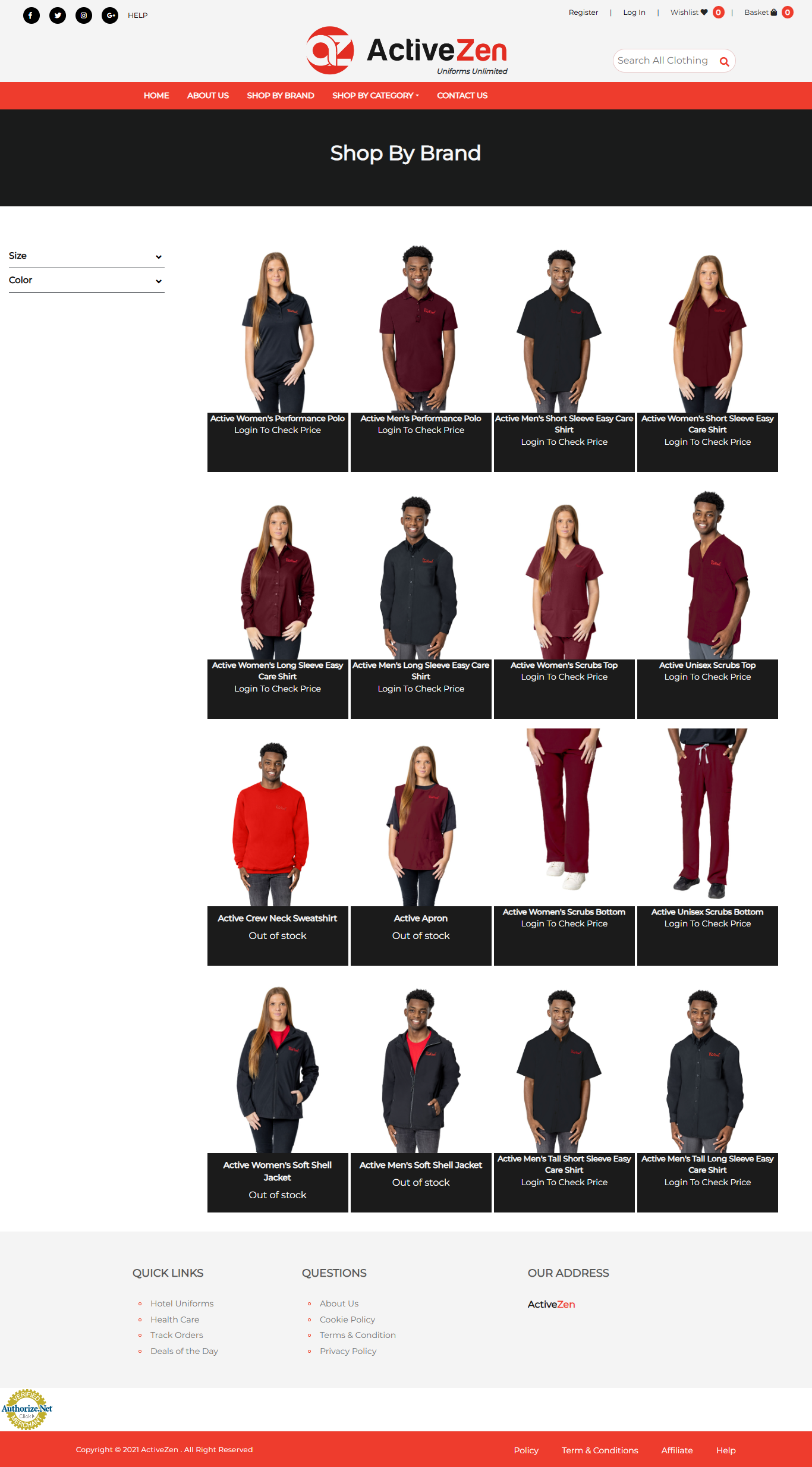 Original Experience
Redesigned Experience
Original Experience
Redesigned Experience
( 🔍 Click to enlarge on any image to view it in full detail. )
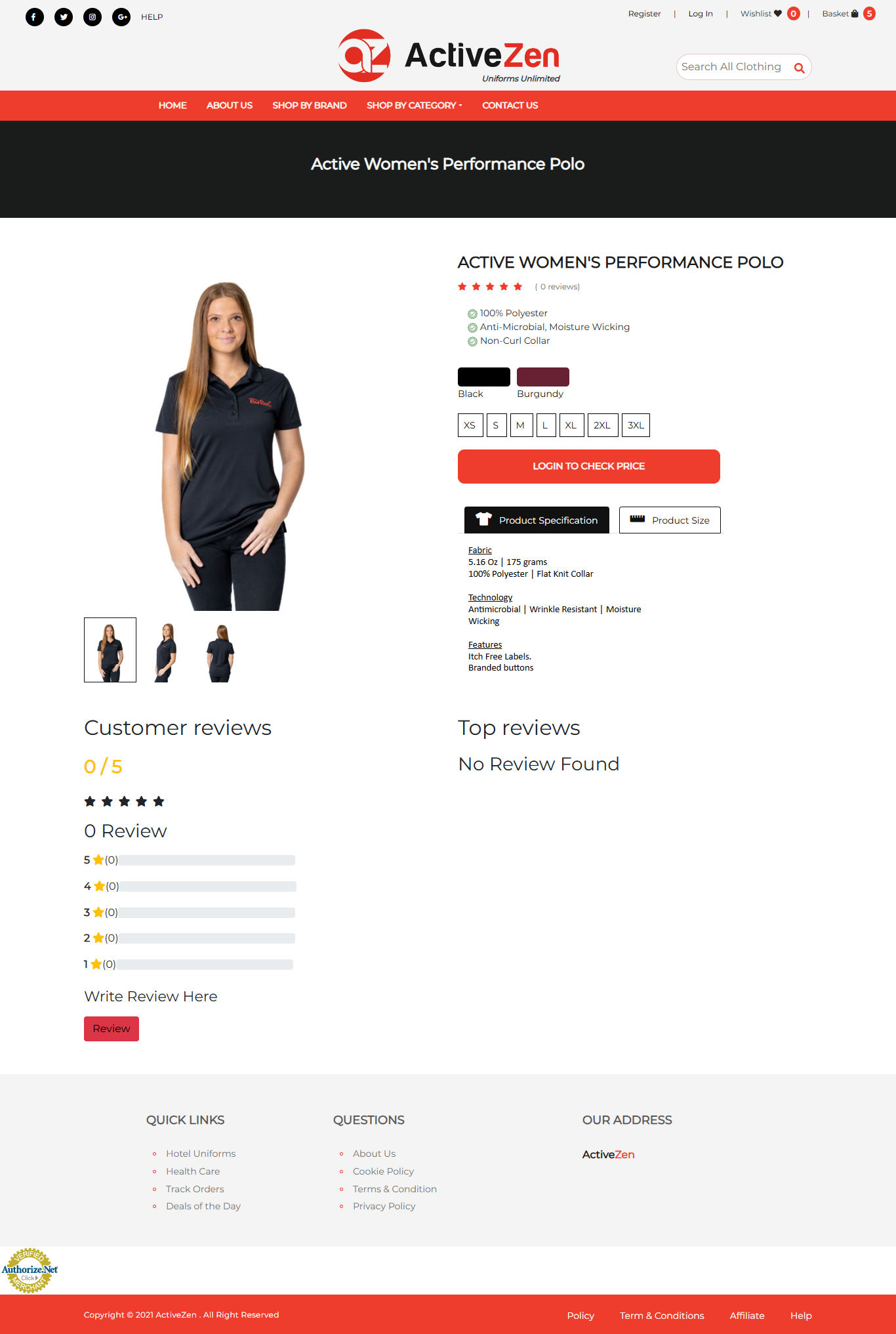 Original Experience
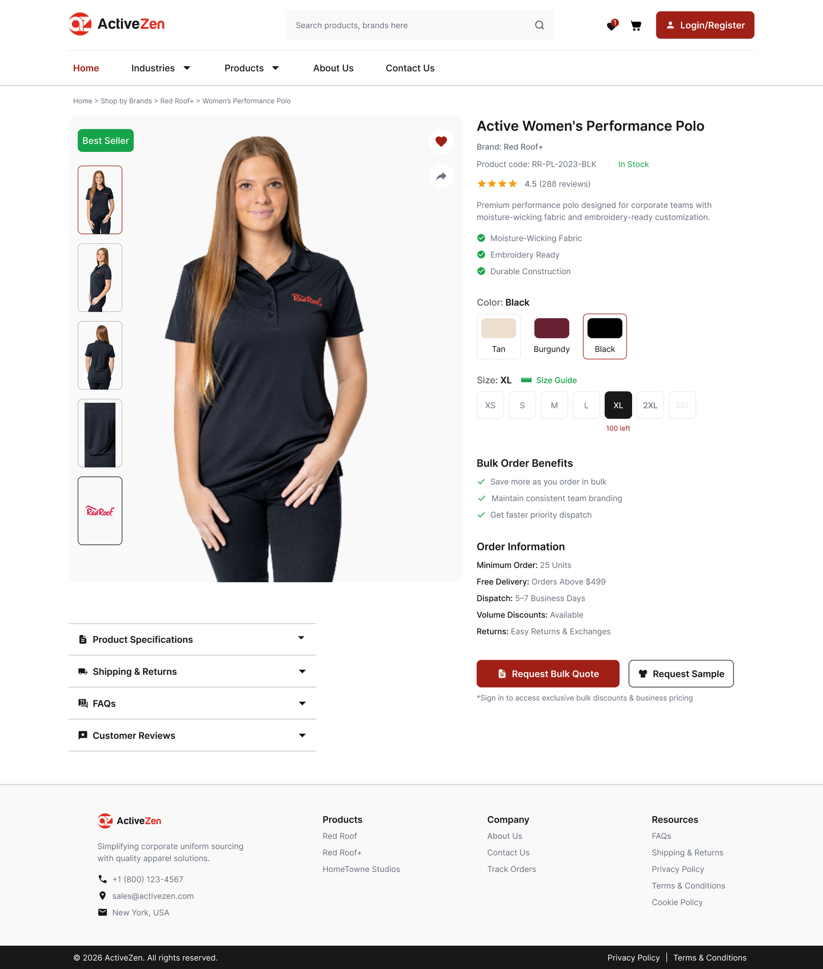 Redesigned Experience
Product Detail Experience
Essential product information and inquiry actions were not prioritized, making purchasing decisions slower for business buyers.
Redesigned the product page with a stronger information hierarchy, visible bulk inquiry actions, and easy-to-scan product specifications.
Bulk Quote Request
The quote request form contained unnecessary fields and lacked a clear information hierarchy.
Redesigned the form with grouped sections and a simplified layout to make bulk quote requests easier to complete.
( 🔍 Click to enlarge on any image to view it in full detail. )
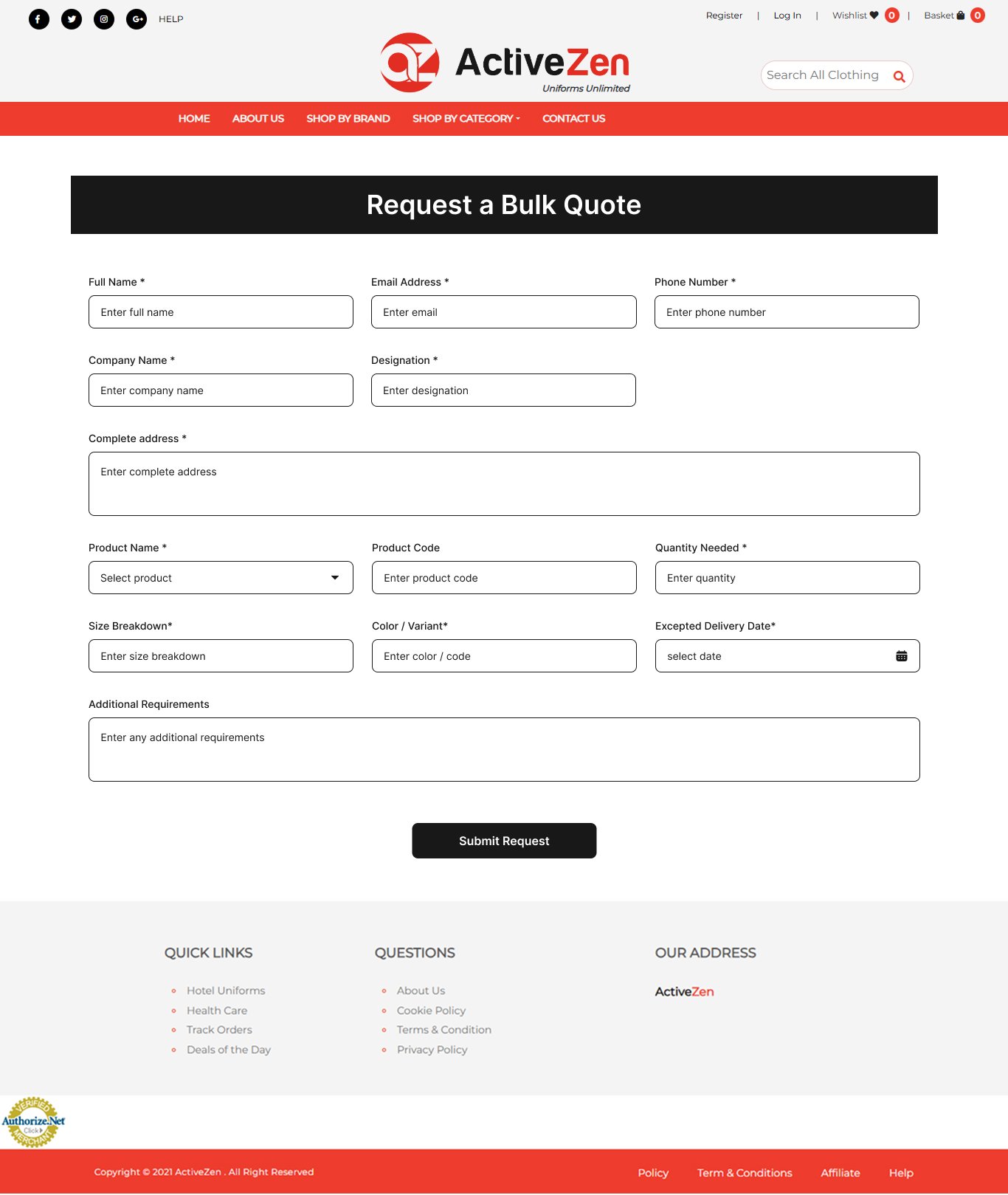 Original Experience
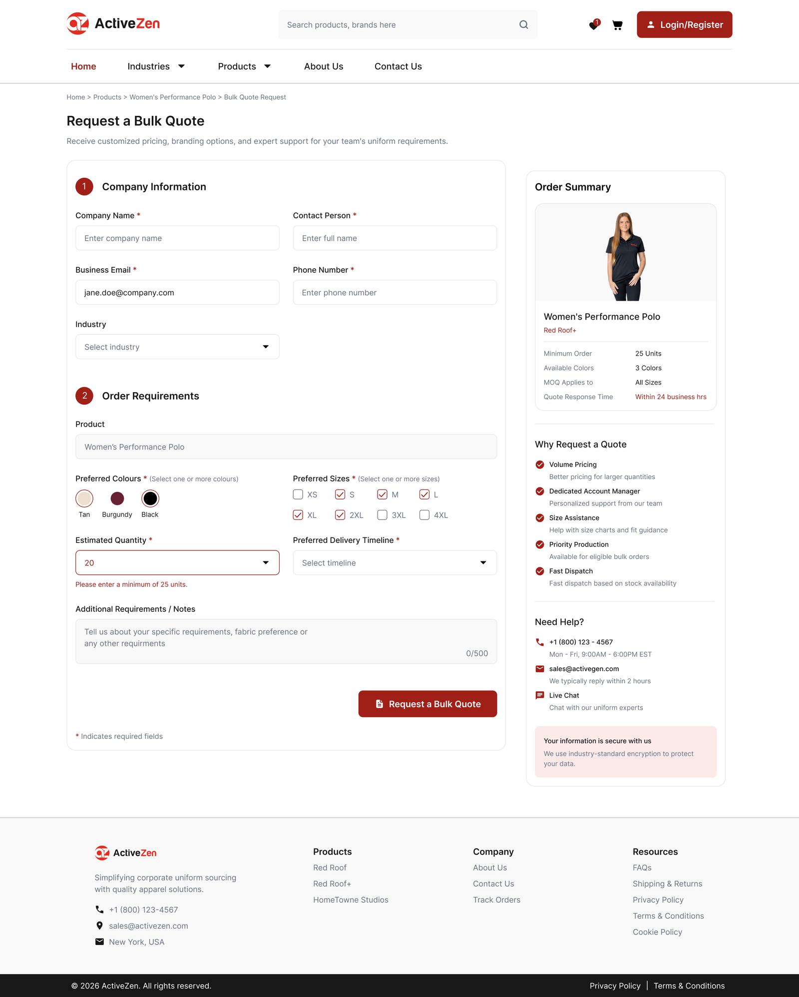 Redesigned Experience
( 🔍 Click to enlarge on any image to view it in full detail. )
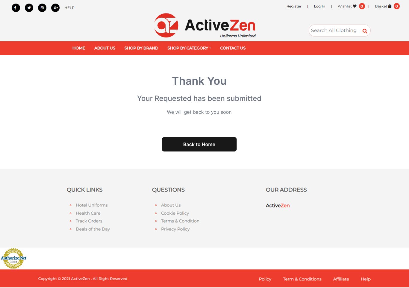 Original Experience
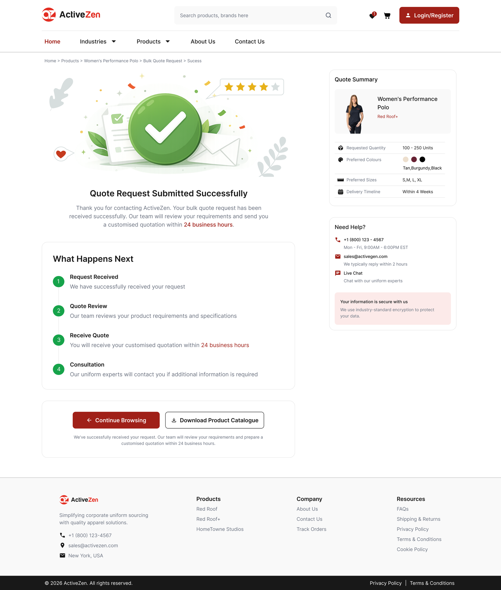 Quote Confirmation
Inquiry Actions Lacked Visibility
Users received limited feedback after submitting a quote request.
Designed a confirmation page with clear success feedback, request details, and next-step guidance.
Results & Reflections
The redesign improved the product evaluation and bulk quote experience by addressing key usability issues identified during the UX audit. A clearer information hierarchy, stronger CTA visibility, and responsive layouts created a more structured experience for B2B buyers.
Expected Impact
-
Improved Product Evaluation:
A clearer information hierarchy and structured content make it easier for business buyers to evaluate products.
-
Stronger Inquiry Visibility:
Prominent, strategically placed CTAs encourage users to request bulk quotations at key decision points.
-
Reduced Cognitive Load:
Improved spacing, typography, and content grouping create a cleaner, more scannable browsing experience.
-
Better Mobile Experience:
Responsive layouts and touch-friendly interactions provide a more consistent experience across devices.
Key Learnings
Better Information Hierarchy
Structured content improves product evaluation.
Clear CTA Placement
Strategic CTAs guide users toward key actions.
Simplified Layouts
Cleaner layouts improve scanability and usability.
Designing for B2B Users
Support business decisions, not just product browsing.
Final Reflection
This project reinforced that effective B2B UX goes beyond visual design. Clear information hierarchy, strategic CTA placement, and structured product evaluation help business buyers make confident purchasing decisions.
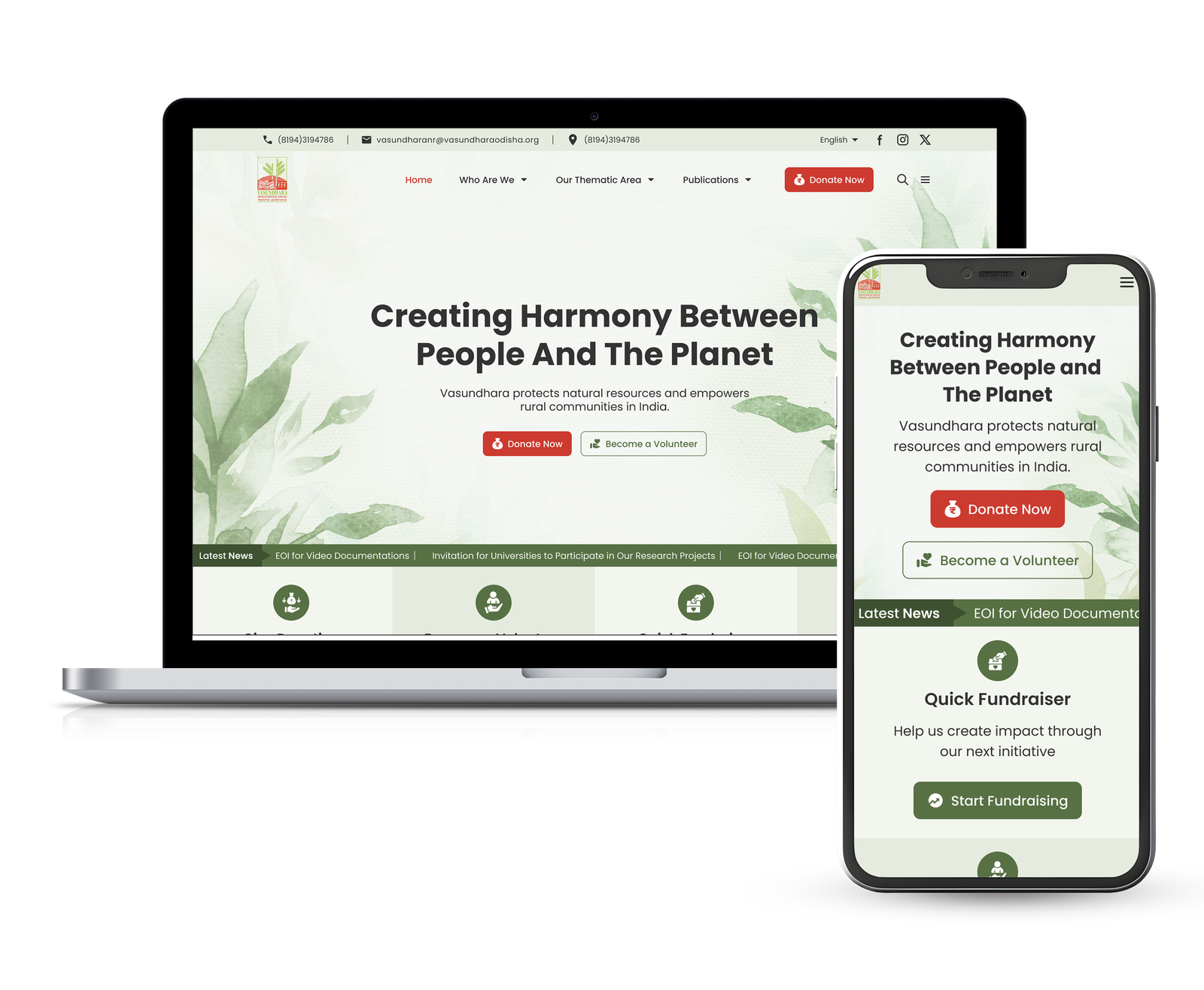
Tribal Help Website
Simplifying scheme access for rural users across Odisha.
Tribal Help Website
Simplifying scheme access for rural users across Odisha.
Get In Touch
Interested in collaborating or have a project in mind? Let's talk!